


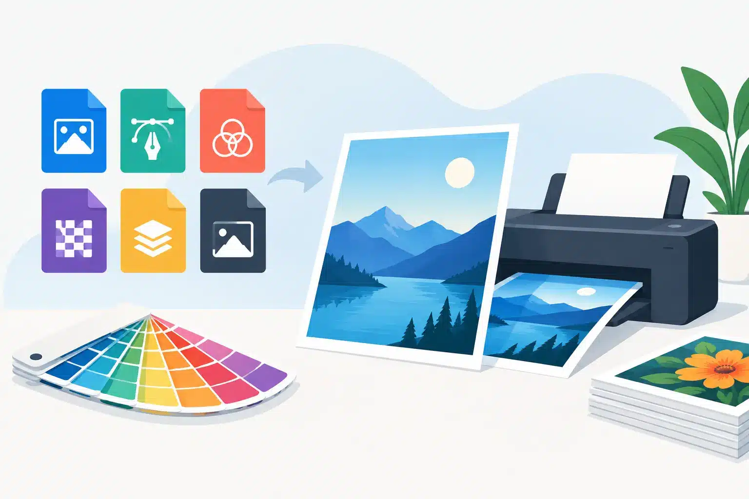
A flyer can look perfect on a phone and still print with fuzzy photos, a thin white edge, or a logo that is smaller than expected. The difference usually comes down to the file you send. This guide to print file formats explains what your print shop needs, why some files behave better than others, and how to prepare your project with fewer surprises.
Whether you are printing school forms, family photos, menus, event flyers, business cards, or a few pages for a community group, the best format depends on what is in the file and how it will be printed. You do not need to become a designer to make a good choice. A few practical checks go a long way.
Guide to Print File Formats: Start With a PDF
For most finished documents, PDF is the best place to start. A PDF holds the layout in place, so the fonts, images, spacing, and page breaks are much less likely to shift when the file is opened on another computer. That makes it a dependable choice for flyers, resumes, signs, forms, booklets, invitations, and business materials.
Export your completed project as a PDF rather than printing directly from a browser, email attachment, or word-processing file whenever possible. If your document uses a special font, a PDF helps prevent the printer from substituting a different one. It also keeps carefully placed photos and graphics where you intended them to be.
Not every PDF is identical, though. A PDF made from a crisp, high-resolution design will print well. A PDF created from a blurry screenshot will still be blurry. The format protects the layout, but it cannot add detail that was not there in the original.
For a simple one-page document, standard PDF settings are usually fine. For full-color pieces with artwork reaching the edge of the paper, ask about the preferred PDF settings before finalizing your file. That small step can save a reprint.
Know the Difference Between Image and Design Files
Image files are common because they are easy to save, share, and recognize. The two formats you will see most often are JPG and PNG.
A JPG works well for photographs. It keeps file sizes manageable, which is handy when sending several vacation photos or a photo-heavy flyer. JPGs use compression, however, and repeated saving can reduce image quality. Start with the original photo when you can instead of downloading, screenshotting, and resaving the same image several times.
A PNG is often better for logos, screenshots, simple graphics, and images with transparent backgrounds. If you have a logo that needs to sit cleanly over a colored flyer or label, a PNG may preserve the edges better than a JPG. PNG files can be larger, so they are not always the most convenient choice for a large batch of full-page photos.
TIFF files are also used for high-quality images, especially in more design-focused projects. They can preserve substantial detail, but their file sizes are often large. Unless a project specifically calls for TIFF, a high-resolution JPG or a properly prepared PDF is usually easier for everyday printing.
The key question is not just which file extension you have. It is whether the image has enough pixels for the size you want to print. A small web image may look fine at two inches wide but turn soft and blocky when enlarged to an 8-by-10 photo or a poster.
Resolution: Why 300 DPI Is a Helpful Target
For most printed photos and graphics, 300 DPI, or dots per inch, is a useful target at the final print size. In plain terms, an image needs enough detail for the dimensions you want on paper.
For example, a photo intended to print at 4 by 6 inches should ideally be about 1200 by 1800 pixels. An 8-by-10 image needs more pixels to stay sharp. Enlarging a small image does not create real detail. It only stretches what is already there, which is why text and faces can become fuzzy.
This does not mean every file under 300 DPI is unusable. A photo printed small may still look great, and some artwork is meant to have a softer or vintage look. Large posters are often viewed from farther away, so they can sometimes work with lower resolution. It depends on the image, the final size, and how closely people will view it.
When in doubt, bring the original file rather than a screenshot from social media. Social platforms often shrink images to make them faster to load. The original photo from your phone, camera, or cloud storage gives you a better starting point.
Vector Files Keep Logos and Lettering Crisp
Photos are made of pixels. Vector graphics are made of mathematical paths, which means they can be enlarged without turning fuzzy. This makes vector files especially useful for logos, line art, maps, icons, and designs with clean lettering.
Common vector formats include SVG, AI, EPS, and some PDFs. You do not need to convert every project into a vector file. A family photo cannot become a true vector image, and there is no reason to force it. But if you are printing a business logo on a banner, sign, shirt graphic, or stack of promotional materials, a vector version is worth locating.
If your designer sent several logo files, keep them together. The file labeled “print,” “vector,” “EPS,” “AI,” or “SVG” is often the one to use for larger or sharper output. A JPG logo may be fine for a small document, but it has limits when enlarged.
Watch Your Size, Margins, and Bleed
A file can be high quality and still print differently than expected if the page setup is wrong. Before sending it, confirm the finished size: letter size is 8.5 by 11 inches, while a standard business card is 3.5 by 2 inches. A design made at the wrong dimensions may need resizing, trimming, or redesign work.
Leave a safe margin around important text, phone numbers, and faces. Home and office printers often cannot print all the way to the paper edge. Even when a project is trimmed after printing, slight movement during cutting can happen. Important information placed too close to the edge may be cut off.
If you want color, a photo, or a pattern to run all the way to the edge, the design needs bleed. Bleed is extra artwork extending beyond the final cut line, usually by about one-eighth inch. After trimming, that extra area prevents unwanted white slivers around the border.
A white border can be a clean design choice. Just make it intentional. If you want edge-to-edge color, mention it when ordering so the paper size, bleed, and trimming plan match the project.
Color on Screen Is Not Always Color on Paper
Screens create color with light, while printers place ink or toner on paper. That is why a bright blue on your phone may print slightly darker, and a neon-looking green may not appear quite as intense on paper.
Most everyday files are built in RGB, the color mode used by phones, cameras, and screens. Professional print files may be built in CMYK, the ink-based color mode used for many printed projects. For routine documents and photos, a print shop can often work from RGB files without trouble. For branded materials where an exact shade matters, ask about color handling and provide any brand color information you have.
Paper also changes the result. Glossy photo paper makes colors appear richer and images sharper, while matte paper reduces glare and has a softer finish. Uncoated paper is easy to write on and works well for forms, handouts, and everyday copies. There is no universal best choice – the right paper depends on how the piece will be used.
Files That May Need a Little Extra Help
Word documents, PowerPoint presentations, Canva exports, and Google Docs are useful creation tools, but they are not always ideal as final print files. Fonts can change, lines can reflow, and graphics can move when the file opens on a different device. Exporting to PDF usually solves most of those issues.
Editable files are still helpful when you expect changes. A restaurant menu that changes seasonally, a club newsletter with last-minute updates, or a business form that needs a new phone number may be easier to revise in its original program. Keep both versions: the editable source file for future updates and the PDF for printing.
If you are unsure whether a file is ready, do not guess by looking only at a thumbnail in an email. Open it at full size, check spelling and contact details, and make sure the images look clear. For a project with several pages, flip through every page before sending it. One accidental blank page or sideways image is easier to catch before printing.
A Quick Pre-Print Check
Before you send a file, confirm these details:
- The final size and number of copies are correct.
- Photos and logos look sharp at the size they will print.
- Important content has breathing room away from the edges.
- The file is saved as a PDF when the layout is final.
- You have checked page order, spelling, dates, phone numbers, and email addresses.
For a simple black-and-white copy, these steps may take less than a minute. For an event poster, graduation program, or small-business handout, they can prevent the kind of mistake that becomes much more noticeable once there are 50 copies on the counter.
Liquid Books is happy to help local customers sort out the practical side of a print job, especially when the difference between a JPG, PNG, and PDF feels less clear than the project deadline. Bring in the original files if you can, along with a clear idea of the finished size and how you plan to use the piece.
The best print file is the one that fits your project: a clean PDF for a finished flyer, a high-resolution JPG for a favorite photo, or a vector logo when crisp scaling matters. Start with the best original you have, give your design a little room around the edges, and your next stack of prints can look as good on paper as it did in your hands.
 Previous Post
 Next Post