


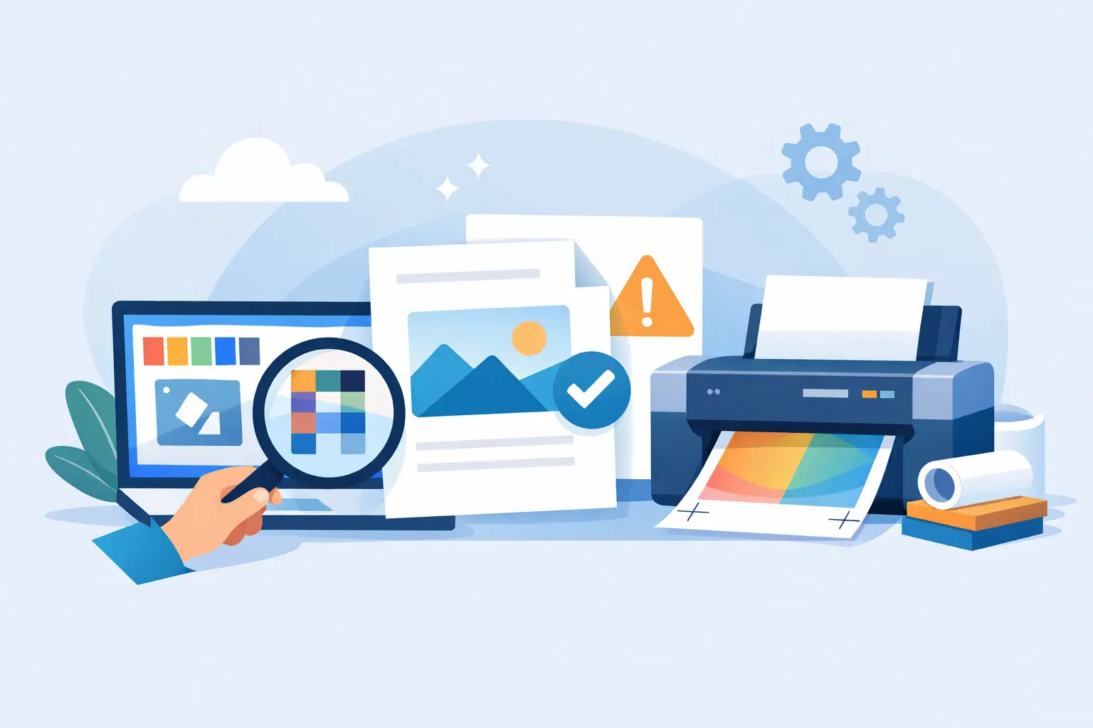
A flyer can look perfect on your phone and still come out too dark, cropped, blurry, or smaller than expected. Learning how to prepare files for printing takes a few practical checks, but those checks can save paper, time, and the frustration of redoing a project. Whether you are printing a school handout, family photos, event posters, menus, or business cards, a little setup goes a long way.
Start With the Finished Size
Before choosing a font or adding another photo, decide what the printed piece needs to be. Standard letter size is 8.5 by 11 inches, which works well for forms, notices, and everyday documents. Flyers may be letter size, half-page, or larger. Business cards, postcards, labels, and custom signs each have their own dimensions.
Set the document to its final size at the beginning whenever possible. Designing an 8.5 by 11 inch flyer and then shrinking it to half-page can make type harder to read and details less clear. Enlarging a small file has the opposite problem: images can become soft or pixelated.
If you are unsure what size makes sense, think about how people will use it. A take-home coupon needs to fit comfortably in a purse or pocket. A bulletin-board announcement needs to be readable from a few feet away. A restaurant menu or price list needs enough room for customers to scan it without squinting.
Use Enough Image Resolution
For photos and graphics, resolution matters. A file can appear sharp on a computer screen but lack the detail needed for a clean print. For most printed projects, aim for images at 300 pixels per inch, often written as 300 PPI or DPI, at the size they will appear on the page.
The key phrase is “at the size they will appear.” A 300 PPI image that is three inches wide may look great in a small photo box. Stretching that same image across an 11-inch-wide poster will reduce its effective resolution and may make it look blocky. Social media images and screenshots are especially likely to be too small for larger prints.
When possible, start with the original photo from a camera or phone instead of a screenshot, a compressed text message image, or an image saved from a social platform. If a photo is slightly soft, it may still work well for a small handout. For a large poster, banner, or photo enlargement, ask before printing so you can choose the best option for the file you have.
Leave Room at the Edges
Most everyday printers cannot print all the way to the edge of the paper. That unprinted area is called a margin. Keep important text, logos, phone numbers, and faces comfortably inside the page edge so nothing gets clipped.
For standard documents, a half-inch margin is a safe starting point. Some projects can use narrower margins, but that depends on the paper, printer, and finished look you want. If your background color or image needs to run all the way off the page, the job usually needs a little extra image area called bleed. The sheet is printed larger and trimmed down to the final size.
Bleed is common for postcards, brochures, book covers, and polished promotional pieces. A simple office flyer usually does not need it. What matters is making that choice before the file is sent, not after the design has already been built around edge-to-edge color.
Make Text Easy to Read
A beautiful typeface is not always a practical one. Small, thin, decorative fonts can disappear when printed, especially in light colors or on textured paper. For body text, choose a simple font and give it enough size and spacing. Eleven or 12 point type is often comfortable for a letter-size document, while signage needs larger text based on viewing distance.
Check contrast too. Pale gray words on a white background may look subtle on screen but can be difficult to read in print. Dark text on a light background is usually the clearest choice for directions, contact information, prices, and anything a customer needs to find quickly.
If your document uses unusual fonts, consider saving it as a PDF before bringing it in. A PDF holds the layout in place more reliably than an editable document. Otherwise, a missing font can be replaced automatically, changing line breaks, spacing, and the overall look.
Check Color With Realistic Expectations
Screens create color with light, while printers place ink or toner on paper. Because they work differently, the printed version may not match a glowing monitor exactly. Bright neon shades, very saturated blues, and deep dark areas are common places where expectations and paper reality can differ.
For many everyday projects, a standard color file is all you need. If you are working in design software and have the option, CMYK color mode is generally better suited to commercial printing than RGB. Still, the file format, paper choice, and printer all affect the final result, so color mode alone does not guarantee a perfect match.
Paper changes color perception as well. Photos often look richer on glossy or satin photo paper, while matte paper offers a softer, less reflective finish. A colorful invitation can look different on bright white cardstock than it does on cream paper. For a project where brand colors, artwork, or family photos truly matter, a test print is worth considering.
Export a Print-Ready PDF
A PDF is usually the safest format for sharing a finished layout. It preserves page size, placement, fonts, and images better than many editable files. When exporting, choose a high-quality or print setting rather than a reduced-size option meant for emailing or web viewing.
Before saving, look through every page at full size. Check that pages are in the right order, blank pages are intentional, and no text boxes extend past the edge. Make sure photos are not accidentally rotated and that a colored background covers the areas you expect.
For simple documents, a Word file, image file, or presentation file may print just fine. A PDF is especially helpful for multi-page documents, flyers with lots of design elements, and anything that needs to look the same from one computer to another.
Review the Details That Cause Reprints
A final proofread is more than checking spelling. Read phone numbers digit by digit. Confirm dates, times, addresses, prices, email addresses, and registration details. A typo in a paragraph is annoying; a wrong event date can make an entire stack of flyers unusable.
Also look for practical details: Is the correct side of a double-sided piece paired together? Does the file say “Page 1 of 2” when it is really four pages? Are there enough copies for the class, meeting, mailing, or event? If you are printing a folded piece, make sure the panels are arranged for the fold style you want.
For large jobs, specialty papers, or materials you plan to hand out publicly, print one copy first if possible. Hold it at arm’s length, check the front and back, and read it like someone seeing it for the first time. That quick pause catches more than you might expect.
Bring the File and the Project Plan
The file is only part of the job. Be ready to explain how many copies you need, whether you want color or black and white, single- or double-sided printing, and what paper you have in mind. If you need folding, trimming, collating, or help adjusting a design, mention that up front.
At Liquid Books, face-to-face print help can be useful when a file is confusing, an image needs a second look, or you simply want someone to confirm the setup before the copies start. Bring the file on a flash drive, email it ahead if that is available for your project, or ask what format will be easiest to work with.
A well-prepared file does not need to be complicated. Choose the right size, use clear images, protect your margins, save a quality PDF, and give the final details one calm review. Then your project is ready to leave the screen and do its job in the real world.
 Previous Post
 Next Post